Showing posts with label A2 Media. Show all posts
Showing posts with label A2 Media. Show all posts
Wednesday, 2 March 2016
Tuesday, 1 March 2016
Completed Magazine Advertisement
We wanted our magazine advertisement (edited on Adobe Photoshop CS5 ) to include key information, such as:
- the name of our band (Disciples of Rock - so they would know who to check out, if they enjoyed the songs)
- the title of the album (L.O.U.D - as we wanted to give the audience a clue as to what this album is about - breaking free and not standing in the silence any longer)
- the best selling song of the album (What Do You Want? - to advertise the music video also)
- the release date, so they now exactly when they can get it
- some 5* reviews, so they know that the album is worth listening to - also the reviews are from HMV and iTunes (so they know where they can purchase the album)
 |
| The rubix cube matches our key prop in the video which symbolises how our artist is no longer being manipulated like a puzzle would be, the colours also match the loud vibe we were trying to create. However we felt that for a rock genre this did not stand out enough and engage our target audience and not everyone would be able to figure out that symbolic code of the cube. |
 |
| With this idea we were going to have an image of the artist holding her head and then add some musical instrument flying from her head - similar to thoughts, however although an intriguing idea we felt that the image contradicted our idea that the artist is now bold with a new status of independence. |
 |
| We therefore opted to use a more outgoing pose which relates to the rock genre (with our artist making the stereotypical rock hand gesture), she can also be seen wearing a leather jacket and headphones - thus implying her involvement with musical rock. But this image was fairly small and we felt it could be hard to make our properly. |
 |
| Thus we chose this image which emphasises rock even more (with those rock hand gesture and an intense face - something many relate to rock musicians), the image also includes lots of loud colours like the rubix cube (linking directly to the album's message about making noise). |
Final Idea
 |
For our final idea however we thought it best to remove the black and white gradient from the background, as it drew too much attention away from the imagery and the key information by over-crowding the advertisement. The black background also allowed for a more professional look were you can't see the surrounding black boxes of the text and image. |
Completed Digipak
 |
Having used this template we were able to create our digipak on Adobe Photoshop CS5 |
 |
| Our Front Cover |
For our digipak we really wanted to convey how our artist is trying to break from her long kept silence, this is why although the artist has her mouth shut, she can be seen (in almost a x-ray like fashion) with musical instruments (guitar, drums, microphones, musical lyrics and a speaker) in her throat (to symbolise her new found voice). The effect we have chosen is great, as it emphasises the colours well, linking visually to our use of the rubix cube (which we feel represent the manipulative game she's trying to break free from)! (Hence our album is called 'Loud'.)
| Spine |
 |
| Inside Left |
For our inside left cover, we opted to show our artist in an almost evolutionary stage (starting from an almost unnoticeable ball hidden in the corner of the room, until she reaches her new found freedom of speech). We also felt this filter added the idea of not only sound waves but chains (again what she's breaking free from).
 |
| Inside right |
We have included a bright colourful background to emphasis the loudness of our album and then the vinyl is a record player including the title of the album and the name of our band. The colours link to the rubix cube we used within the music video and emphasis our theme of a 'game'. In addition the messy overlapping lines convey the 'loudness' of the album and video. |
Back Cover
|
Our back cover simply shows the songs within the album (with the number one hit at the top, so it draws in the most attention). And although quite simple with not too much overcroading, it still remains pretty bold and distinctive adding to the theme of being loud. We included not only the barcode but the production teams logo and iTunes (a possible site you could purchase it from).
Finished product


Wednesday, 27 January 2016
Audience Feedback
I have chosen to get some audience feedback on our finished ancillary products from Caitlin because she was interviewed by us before the construction of our products and told us what she would expect from the video particularly as well as other rock related products like the digipak and magazine advertisement. Therefore by interviewing her after the construction I am able to see if we have kept to those expectations and if the ancillary items would actually appeal to her.
Tuesday, 26 January 2016
Audience Feedback
This audience feedback is from a fellow media studies student (who falls into our target audience), by asking the opinion of a fellow student I am able to get greater analyse on the techniques we applied and if she believes they worked with our chosen genre of rock. Whereas someone else not aware of the technical side of things would perhaps give a slightly more vague opinion, furthermore I believe my fellow media students to be harsher critics when assessing my ancillary products because they now what techniques could improve it (and the harsher the remark, the more support it offers me).
Friday, 22 January 2016
Success?
DO I FEEL AS THOUGH WE MANAGED TO KEEP WITH THE GENRE OF ROCK?
WHAT IS ROCK?
The genre rock is a deep heavy metal genre of music it consists mainly of loud songs with the use of guitars and drums, as well as singing. When you type rock into google it is defined as:
 |
| A few of the top rock artists that come up on google |
 |
| Avril Lavigne |
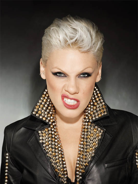 |
| P!nk |
WHAT EACH OF THESE ARTISTS HAVE THAT WE WANTED TO PORTRAY
Each of these artists offer a certain type of attitude, something that is stereotypically identified with the genre of rock. We wanted to incorporate this form of image for our own artist, as she is supposed to be an independent woman standing up for herself quite fiercely with a brand new loud voice!
HAVE WE MANAGED TO MAINTAIN OUR ORIGINAL ASPECTS THEN?
To begin with we as I previously stated we wanted a young, fierce, loud, dominant and independent image for our female artist - an image most identifiable with the genre of rock! During the production of our music video and other ancillary texts we were able to include the use of numerous factors (mainly through the mise en scene and editing stages) that enable our audience to link these themes together. For example she wears a rock identifiable clothing such as traditionally black converse trainer, ripped jeans and a baseball t-shirt and chequered shirt... Due to our use of these factors I believe that when concluding whether or not we have been successful whilst keeping to the genre of rock, we have! Most significantly because we managed to maintain a loud and fast past throughout our ancillary products.
Wednesday, 20 January 2016
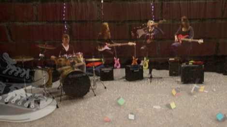
Evaluation of music video

Today we made a mind map of the possible cinematography, editing and mise-en-scene we could have used within our music video.
Blue Circles- Represent the aspects that we managed to include within our video.
Orange Circles- Represent that we developed this.
Red Circles- Represent how we challenged this.
From doing this we saw that we have used everything we put down, which shows that we have effectively achieved our aims of including a variety of camera shots and editing techniques, as well as including all the props stereotypical to our genre. In using all of these techniques it will make our music video more appealing to our target audience and will subsequently help to encode our genre well. In addition we have developed various techniques and have not challenged anything within our mind map. However our use of the rubix cube theme throughout the video is challenging the typical props used and themes of a rock genre e.g skating and rebelling.
Re-editing of music video

Today we got feedback on our music video so far and had the issues with it addressed. The main issue at the moment is the letter boxing, where the size and shapes of the clips we have put together are not all the same. This therefore makes it look unprofessional and will need to be corrected so that the music video is appealing to audiences. As well as this our clips need to be matched up to the lyrics more so that our lip syncing is correctly in time.
The main aspect we want to improve on is how the visuals on the screen change, to match with the beat. For example when a drum comes in we would like to show our band member playing the drum in time to it, to make our music video more effective and catchy to our target audience.
Monday, 18 January 2016
Screen shots and clips for evaluation Question 1
 |
| relationship of lyrics to visuals |
 |
| relationship of music to visuals |
 |
| representation of band and artist |
 |
| genre of music and how it is defined |
 |
| setting/location |
 |
| camerawork and editing |
 |
| mise en scene |
 |
| intertextuality or influence of other music videos (avril lavigne and the costume) |
Monday, 11 January 2016
Evaluation of music video
What went well with creating our music video:
- From lip sync practice I knew how to edit and use markings to match up video clips to the lyrics of the song. This made the process of getting clips onto our timeline and matching them up faster. This way we then had more time to edit each individual clip and use effects to improve the look of our music video.
- Our costumes used on the artist and the band members effectively matched our music video genre. This way the audience could easily decode the style and match it to our chosen genre of rock.
- From audience feedback we found out that our target audience would watch our video more than once, which as a record company was our aim.
- Our props were easy to get hold of as we could use the ones from our school and therefore made filming easier.
- Our music video is set in different locations within our school, which meant that we could film inside and outside our lessons.
- Did not have to travel to locations so therefore saved time, which allowed more time for filming our video.
- We used two cameras while filming to get different shot-angles and therefore made our music video look more interesting, in addition to allowing us to have more clips to use throughout the timeline.
- We previously knew how to create overlapping editing from our AS film trailer, which allowed us to save time when editing as we did not have to learn new skills. Additionally our overlapping linked to the beat of the music as we could effectively show a clip and over lap it with a instrument being played when the beat changed. This made our video then flow and look more appealing to our target audience.
- We learned how to do new editing skills that we did not know previously and made our video look better editing wise.
- The concept of ''games' linking to the rubix cube was effective as it gave us a clear concept and linked to the lyrics of the song, therefore the audience could easily decode our visuals.
What I would do differently next time:
- Next time I would use more locations for our video, such as a actual stage that the band can perform on. We could have made a stage out of equipment from our theatre at school or gone to a venue which hosts small gigs, which my friends sometimes play at.
- Although we used two camera when filming in some clips, I would use two cameras to film every clip we used. This way we would have more shot angles to use, which makes our music video more appealing to audiences, in addition to having more clips to fill our timeline with and use for editing.
- Would include more shot types that are not commonly seen such as high angles looking towards and over the shoulder shots. This then would give the music video more uniqueness, instead of focusing mostly on close-up shots which can become boring to the audience.
What were the difficulties with creating our music video:
- On final cut express I found that when adding another clip to the timeline, the other clips alone the timeline would move and therefore the video and the lyrics would not match up and make our video out of sync. This then was time consuming as we had to reorder our original clips and use markers to match up the video to the lyrics.
- The length of the music provided a problem. This was because our rock genre had to have fast paced clips and therefore every clip we filmed would have to be fasted and added to the timeline on final cut express. As a result of fastening the clips, we had to film double the amount to fill the whole time line compared to a pop genre, which can be slower and have longer durations of each clip.
Sunday, 10 January 2016
What I'd do differently next time?
If I was to improve our coursework process next time particularly the planning and formation of our music video, I would:
- use even more locations to make the video more identifiable as rock. For example the use of an actual stage or a grunge looking area, as it would define our video a lot further (making it 100% genre specific)!
- besides just cutting to the beat of the music and only producing performing shots, we could have included more shots purely of the instruments, because it would make the video less set on advertising the artist's image but solely the music itself (something we wanted our video to display from the start of our process).
- although we used numerous shot types especially towards the end we got some really extreme high shots filmed, I feel that if I was to redo our shot types I could definitely get some more intriguing ones in (tilts, extremely low...). This would have again made our music video more intriguing to the audience as part of the rock genre, because rock is fast, extreme and daring and these shot types edited together quickly may have amplified this.
However if I was to redo our music video, I would keep:
- the theme of not being someone's game anymore, as I feel that's what the lyrics are all about. This includes our use of the rubix cube, as this is a prime example of a game (the artist) that depends on manipulation and constant change in order to finish (to please others).
- the use of coloured lights to portray the coloured blocks found on a rubix cube and the way that they also resemble the loudness our artist is currently creating to break the silence of her long kept mistreatment (whether that's from her boyfriend, family, friends or work...).
-the speedy editing used to reflect on our chosen genre rock, which is of a speedy nature (with lots of fast beats and lyrics).
Thursday, 7 January 2016
Seeing is we kept with the image
When we were creating the image of our artist we wanted to focus more on the music rather than a sexualised artist, therefore we styled the artist cleverly. Our main inspiration when it came to costume and personality was Avril Lavigne who unlike other stereotypical sexualised female artists, opts for a more 'tomboy' appearance with her trainers instead of heels, trousers rather than skirts or dresses as well as her props like a skateboard (all of which depict someone far from a stereotypical dependent woman - a key factor we want to avoid, as she is independent). |
| in this moving image you can see Lavigne's tomboy style that is slightly rocky with her studded accessories and baseball cap she has dark eye makeup to give more of a rock vibe i can see the use of traditional black converse, something lots of rock artists wear and unlike a stereotypical sexualised female artist she is not wearing a revealing outfit |
 |
| similarly we were able to maintain the use of traditional converse shoes she too has dark eye makeup leading to a rock vibe - relating directly to our chosen genre for the album she is not wearing a sexualised outfit like stereotypical female artists, instead she is more tomboyish like Lavigne - linking to her independent image her hair is also of a similar style there is not much exaggeration towards it, again keeping her image less sexualised |
Overall I would say that whilst attempting to create a similar image to Avril Lavigne, we have managed to accomplish our goal with numerous links between both artists! I feel that this image has been a positive one in terms of the rock genre, as it suits it focus on music better.
Friday, 18 December 2015

Thursday, 17 December 2015
Possible pictures for our album cover


Friday, 11 December 2015
Unfinished version of our music video for audience feedback
We decided to show our nearly finished music video to our target audience to gain their feedback and use their comments to develop our product. Through this we found that they thought our use of costumes and props linked effectively to our genre, as well as the clips linking to the lyrics and beat of the music. Additionally we found that they believed our concept of linking "games" with the genre was effective and original, as well as the fact that they would watch our music video more than once. This is good as our aim was to have props, costumes and a theme that would link to our genre and be easy to decode as a rock genre by our target audience.
Thursday, 10 December 2015
My plan for our magazine advertisement


For our magazine advertisement I felt that the album of the artist should be settled in the centre to make it the main focus of the advertisement. To emphasis the album cover further I would include a colour scheme of black and white vs the colour of the album particularly the old fashioned megaphone situated on her cheek - symbolising her sudden outburst of anger. The font will remain in the style of the rock genre with a similar font to David Guetta's electronic logo which is slightly electronic looking. Additionally the title name 'loud' will be much larger in sizing than the other details to draw attention to the concept of the album which is to break free and use your own voice! But other details include the date of release, our record label, reviews, our website and most importantly we want the song to our music video to be mentioned as the best seller on the advertisement - as it will bring our video more attention.

Magazine advertisement idea
Drawing of my magazine advertisement idea:

For my magazine advertisement idea I took inspiration from looking at previous artists advertisements of their album, as well as the layout within the magazine. I have put the bands name at the top of the advertisement, in the biggest letters so that it stands out to audiences. Furthermore the majority of the space is took up with the artists image which will appear at the front of the album. This is because as it is a new artist, we want to advertise her as well as the band, so she is a popular image within the music industry. In addition the audience will recognise the album within shops as they know what it looks like. Moreover along the bottom there will be reviews out of five, in addition to the release date, record label and production company.
Tuesday, 8 December 2015
Practicing editing still photos
For this I took still photos in various locations and shot types, so we have a range of ideas for what camera angles to use within our music video, to make it more exciting for audiences to watch more than once. On final cut express I then edited each one in different styles and colour themes so that there is a range of ideas to consider for editing that can be used on different parts of our music video. I have tried to stick with a red or black theme so that it goes with our rock genre, therefore audiences will be able to recognise this and decode our video. However I have also used one or two in a paint/blur style, in very colourful colours to represent our artist being in what she describes as a 'game', along with the colours representing the rubix cube.
Analysing music magazine advertisements
Magazine Advertisements
 |
| Jesse.J's magazine advertisement for her album 'Who are you' |
- the artist name
- a picture of the artist
- the album name
- the best selling song on the album - we could make this 'what do you want from me' as it'd make someone viewing it more likely to go straight to that song and its video
- logos of the record label/s
- where you can find the song such as the artist's very own website or somewhere like iTunes and HMV...
- the release date
- any reviews to make the album seem better
Subscribe to:
Posts (Atom)