Wednesday, 30 December 2015
Theme for the artist's message
With our music video we have chosen to select the theme that are artist is trying to break the silence (whether it be in terms of a boyfriend or something else) and her finally breaking free with a voice of her own. We have shown this in multiple ways when producing both the music video and in other aspects such as marketing the magazine advertisement and the CD cover. For example all factors have been produced with the main idea of colour and mise en scene or font... having a loud/ busy and eye catching appeal to them.
Friday, 18 December 2015

Thursday, 17 December 2015
Possible pictures for our album cover


Wednesday, 16 December 2015
Plan for editing in music video
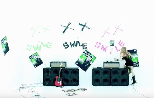
Through looking at similar products from a rock genre, I found that in Avril Lavigne's "Smile" music video, she changed from low key black and white editing, to colour throughout. We decided to use this concept within our music video, by starting it in black and white then changing to colour with the introduction of the rubix cube, due to the theme of a game.

Friday, 11 December 2015
Unfinished version of our music video for audience feedback
We decided to show our nearly finished music video to our target audience to gain their feedback and use their comments to develop our product. Through this we found that they thought our use of costumes and props linked effectively to our genre, as well as the clips linking to the lyrics and beat of the music. Additionally we found that they believed our concept of linking "games" with the genre was effective and original, as well as the fact that they would watch our music video more than once. This is good as our aim was to have props, costumes and a theme that would link to our genre and be easy to decode as a rock genre by our target audience.
Thursday, 10 December 2015
My plan for our magazine advertisement


For our magazine advertisement I felt that the album of the artist should be settled in the centre to make it the main focus of the advertisement. To emphasis the album cover further I would include a colour scheme of black and white vs the colour of the album particularly the old fashioned megaphone situated on her cheek - symbolising her sudden outburst of anger. The font will remain in the style of the rock genre with a similar font to David Guetta's electronic logo which is slightly electronic looking. Additionally the title name 'loud' will be much larger in sizing than the other details to draw attention to the concept of the album which is to break free and use your own voice! But other details include the date of release, our record label, reviews, our website and most importantly we want the song to our music video to be mentioned as the best seller on the advertisement - as it will bring our video more attention.

Magazine advertisement idea
Drawing of my magazine advertisement idea:

For my magazine advertisement idea I took inspiration from looking at previous artists advertisements of their album, as well as the layout within the magazine. I have put the bands name at the top of the advertisement, in the biggest letters so that it stands out to audiences. Furthermore the majority of the space is took up with the artists image which will appear at the front of the album. This is because as it is a new artist, we want to advertise her as well as the band, so she is a popular image within the music industry. In addition the audience will recognise the album within shops as they know what it looks like. Moreover along the bottom there will be reviews out of five, in addition to the release date, record label and production company.
Tuesday, 8 December 2015
Practicing editing still photos
For this I took still photos in various locations and shot types, so we have a range of ideas for what camera angles to use within our music video, to make it more exciting for audiences to watch more than once. On final cut express I then edited each one in different styles and colour themes so that there is a range of ideas to consider for editing that can be used on different parts of our music video. I have tried to stick with a red or black theme so that it goes with our rock genre, therefore audiences will be able to recognise this and decode our video. However I have also used one or two in a paint/blur style, in very colourful colours to represent our artist being in what she describes as a 'game', along with the colours representing the rubix cube.
Analysing music magazine advertisements
Magazine Advertisements
 |
| Jesse.J's magazine advertisement for her album 'Who are you' |
- the artist name
- a picture of the artist
- the album name
- the best selling song on the album - we could make this 'what do you want from me' as it'd make someone viewing it more likely to go straight to that song and its video
- logos of the record label/s
- where you can find the song such as the artist's very own website or somewhere like iTunes and HMV...
- the release date
- any reviews to make the album seem better
Analysing music magazine advertisements
Analysing conventions of a magazine advert for a CD:
I looked at the Arctic Monkey's advertisement for their CD within a magazine, looking at the conventions of the layout, colour, text and themes. The name of the artist was the biggest on the ad, showing that they rely on their branding alone to draw attention. The CD was a medium close up of a girls face, showing that the artists are not even on the advertisement, which could suggest they are not interested in promoting themselves/ their image, but the music itself.
The main conventions that are normally seen within a magazine advertisement for music is:
1) The artists name
2) A picture of the artist/band
3) The logo or name of the record label
4) Reviews in the style of stars out of five
5) The release date of the album
6) The albums names, in addition to some of the previous singles being advertised

Monday, 7 December 2015
Album Name

These are words that we have brainstormed in relation to our song genre and artist, we hope to get an idea of an album name from these.
When brainstorming we thought about how the artist is singing about her controlling relationship and how now she is tired of her partners 'game' and how she just wants 'independence' rather than the 'mayhem' its causing her to feel. We also believed that her relationship could resemble a natural disaster hence the use of 'riptide'...
But overall we like 'independence', 'play' and 'loud' the most, therefore we hope to use these within our album name.
Thursday, 3 December 2015
Friday, 27 November 2015
Analysing the success of music videos


From looking on the top best selling music videos on iTunes, it is clear that the pop genre dominants the sales. This is a good type of research to conduct as it allows me to see the most successful video for its visuals, rather than the song having an influence. The top best selling is Adele's 'Hello' video, which is filmed using a variety of shot angles, with the most common being a close up of the artists face. In addition the music video is slow paced and has a series of slow-motion shots, as well as being in sepia effect all the way through.
Overall through looking at the majority in the top best selling music videos there is a common theme of dance moves, big effects and close ups of the artist. Through this research we can therefore take these themes and portray them within our music video so that it attracts our audience more into watching it.
Editing for our music video

One type of editing that looks effective on our music video is the use of still pictures. We took 12 different stills of our artist holding the guitar at different angles, all in the position of clock hands. We then lined them up along our timeline in the right order and made the speed faster for each individual one. This way when played the still shots would look like a moving image/timelapse of the guitar representing a clock going round. This additionally looks successful as it matches the lyrics of our song through "Don't wanna waste my time on you again", and still keeps the rock feel to the music video.
Getting ideas from different social media

To portray what type of props we have used in our music video i have used the website Pinterest to make a 'board' displaying pictures of the items. Each prop is stereotypical for our rock, therefore our audience will be able to decode the genre of our video fairly easily. The only prop that does not stereotypically fit our genre is the rubix cube. This is because we have decided to make our video stand out, so that the audience will want to view it more than once and not follow the usual look of rock genres, as through our research we have found they are not as popular amongst our target audience as pop genres are. Through this change we hope to attract more audience and additionally link to the lyrics of our song, for example "I am not your game".
Tuesday, 24 November 2015
Researching the Design of Marketed Products in HMV
 |
| Rhianna stood by the top sellers |
 |
| she is telling someone to be quiet |
 |
she is biting down on a chain
|
As we are about to start creating products like CD covers, we felt that it would be a good idea to visit somewhere that has a diverse amount of similar products (like HMV) in order to see what we like and get an idea of what we want our own CD cover to look like. One of the most influential factors we obtained from visiting was the fact that we could see which CD's were selling the most, giving us an even better idea of what a good cover looks like. For example Adele's CD was the best seller and unlike the rest it stood out due to its desaturation and boldness with the close up on her face.
P!nk
We thought it would be a good idea to look at our main inspiration (P!nk) as an example of what our CD cover may look like. Having looked at 2 of her CD's it is obvious that she opts for a fierce independent look, something which could be a great aspect for our artist (as her lyrics are about the fact that she is independent).
 |
| this CD shouts rock to us |
 |
| this CD cover shouts rock to us |
 |
this CD cover shouts rock to us
|
Rock Genre
When we visited HMV we thought it was imperative that we looked at rock genre CD covers, as we feel our cover also needs to display what genre we have chosen. Having looked at multiple ones we felt that the use of darker colours like reds and blues seem to be identified more with the genre (perhaps due to their intensity) - we want our song to be associated with intensity also. Furthemore rock styled CD covers seem to have quite emotive figures on them. for example Paolo Nutini has a very emoive face and Thin Lizzy has a powerful stance on his cover - these powerful and emotive poses leaves the suggestion that their music if good (as it is very moving). This could be something we incorporate in our own CD cover as we like the idea that the artist is displayed at moving and perhaps even inspirational.
 |
| guitars central to CD |
 |
| guitars central to CD |
Guitars
We found a couple of CD's which focus purely on the music rather than the artist. For instance both these CD covers have guitars as their main feature rather than their artists. This is something really important that we have tried to incorporate from the start of our process, as we don't want our artist to be too sexualised (we want the music to be the main feature to the video and other products like the CD).
 |
| the thermal colours and geometric style |
 |
| the colour scheme |
Colour
For something to stand out it usually means its got a lot of colour that makes it appealing to the corner of your eye. These 2 CD covers both have a lot of colour and the this makes them stand out well. Particularly with the use of our rubix cube theme, we feel that colour on our CD could be a significant choice.
For something to stand out it usually means its got a lot of colour that makes it appealing to the corner of your eye. These 2 CD covers both have a lot of colour and the this makes them stand out well. Particularly with the use of our rubix cube theme, we feel that colour on our CD could be a significant choice.
Positioning
 |
the logo placement is intriguing
|
 |
his placement and the background
|
 |
| the movement of her hair |
Each of these 3 CD covers along with many others have been carefully and cleverly positioned to attract buyers and make the artists appear within their personality types and genre of their music. For instance each artist is positioned centrally as it makes them the main feature of the cover, however The Vamps are positioned in a roughly with serious expressions (in an attempt to make them appear amnly - perhaps because they dont want to be associated as a teen boyband anymore), where as Ellie Goulding is portrayed as angelic (as her hair has been positioned to mask her from others - creating an innocent look), and Bieber is positioned looking downwards with a prayer like position to make him seem almost 'holy' perhaps because he wants to be portrayed as a good person. Because positioning can change so much about the way an artist is portrayed, it is very crucial that we position are artist carefully.
Other forms of marketing we saw in HMV
 |
| Record covers |
 |
| Merchandise |
Monday, 23 November 2015
A few things I've learnt along the way
Working on my Media Studies coursework, I have learnt various things:
- I have learnt to blog properly - I can use plenty of external applications such as Scribd... and submit them into our group blog easily. Having the capability to do so, I feel has enabled me to broaden my knowledge on computing and given me a diverse understanding of marketing on the internet.
- I have also been able to further my ability when it comes to editing - although having been able to edit successfully last year when producing my opening sequence to a thriller film, I feel that this year I have increased my ability to edit via the use of filters and transitions.
- Using the camera this year, I have been able to lengthen my skill when handling it, as I now know multiple camera shots - some even more interesting then last year! For example using a tilt is something I have found intriguing.
- This year I have also learnt more about the audience and their desires for the video by asking them directly. For example the responses from my Survey Monkey questionnaire and our Twitter/ Facebook accounts. Using audience feedback like this, I expect our music video to be better than if we were to just do it in our own style, as it has been analysed more and adjusted with not just our opinions but varied opinions.
Thursday, 19 November 2015
Storyboard changes and progress
We decided to make a video discussing our storyboard changes and why we have decided to remove clips or edit our storyboard. Additionally we explained what more we were going to do and how we were going to film certain clips.
Wednesday, 18 November 2015
Key artist to look at when establishing our image
For our artist we want to focus less on the image but the music itself, this is therefore why we are choosing to not sexualise her image and although there will be a loud image due to the message about her finding her voice, this relates back to singing/ music!
Whilst trying to represent this in our ancillary products, we have looked at numerous artists who similarly try to shy away from their image and instead put one-hundred per cent into what they are creating.
For instance our largest inspiration in this field is Coldplay. They are an excellent example to examine for this aspect of becoming artists, as they put all their input towards the music itself rather than looking a certain way to create a pleasing image for their audience. Instead their process of making music is to spend time on the tune and lyrics (no matter how long it takes them to finish a track) and it doesn't matter if the music is widely accepted as popular, it's if the music pleases them that truly matters!
 |
| perhaps why they never show themselves on the front cover of their albums |
Wednesday, 11 November 2015
lip syncing practise
We were given two clips, one of a woman lip syncing and the other was the music that went with it. We then tried to match up the lyrics with the video and get both in place. Additionally this was good as it gave us practice for making our own music video and allowed us to see how to line up both clips with each other using markers.
Tuesday, 10 November 2015
Twitter account and audience feedback
 |
| home page |
 |
| purpose of twitter |
 |
| desaturation |
Having asked some target audience members (girls aged 17-22) what they'd be interested in introducing to a rock music video, I have found out that the majority would suggest desaturation. this may be due to the stereotypical dark palette rock is usually associated with. for example you don't tend to come across a rock music video with bright colours like pink or green... Therefore the use of black and white could potentially link our music video further with the rock genre!
 |
| upbeat |
After asking our target audience what connotes the genre rock, I found that it lies with the speedy music created by stereotypical rock instruments such as guitars and perhaps drums also. Therefore I believe that it is going to be imperative for my music video to include instruments as well.
 |
| eye catching |
Furthermore our audience think that to produce a suitable music video we should make it eye catching in order to grab our audiences attention.
 |
| fascinating |
So to make our artist stand out and become appealing I think that by using a unique prop not found in most music videos we will be able to make the video non generic and intriguing.
 |
| desaturation |
Although I asked our target audience their ideas for the music video, I also asked what they expect from rock music videos! These two questions sound practically identical however what the audience wants and expects is very different (however in this case they have responded with the same answer)! The fact that the audience have mentioned desaturation twice infers that it would be a good aspect to use in our music video as it obviously connotes rock for our chosen target audience. Also, black and white will help make our chosen prop (rubix cube stand out well as we can use a Pleasantville effect to make it pop with colour.
Monday, 9 November 2015


Editing photos for music video

These photos have been edited on Pixlr with an overlap. I have done this so they can possibly be used within our music video.
Within our song there is a repeated line saying "I am not your game", which is an ideal place to have one or both photos pop up. The top picture is overlapped with Pacman, the most famous arcade game for over 30 years. In addition to the second picture, which is an overlap of colourful circles, which looks like the connect-four game, but even further links to our frequent use of an Rubix Cube. These pictures, when matched to the lyrics of the song will be effective as the audience can easily decode the meaning of the song, as the visuals have a clear link to the lines the artist is singing. In addition it will also make our music video better visually, as throughout the first half of the storyboard the visuals will be in black and white until further on in to the song where these pictures will be places. The change in colour will signify the artist becoming more independent, in which the lyrics imply that she is standing up for herself, compared to the first half of the song, which will represent her in a depressed/angry mood, connoted through the dark lighting.
Sunday, 8 November 2015
Friday, 6 November 2015
Audience feedback of our location


I have took to social media to ask our target audience about the location we are using for our rock genre music video. This is so I can know we are following what is stereotypical of a rock genre and so I know it is clear to the audience what genre our music video will be before hearing the lyrics. The replies showed that our location is effective for our genre, which is significant as we want our audience to view our music video more than once.
Subscribe to:
Comments (Atom)